Color Grading Workshop

Color correction should always be one of the very last steps in the editing workflow. Color correction requires computer hardware to be consistently set to the same color space as the video equipment used to capture the footage (sRGB).
Our visual communication of colors to narrative are very literal and simplistic. We borrow strong visual cues from nature, culture, and previous media. We are conditioned to understand that light and color evoke feelings and reactions within the context of video.
Blues suggest cool environments, night, tension, emotional distance between characters.
Reds suggest anger, intensity, speed, heat, dryness.
Yellows suggest warmth, safety, comfort, joy, relaxation, nostalgia.
'Greens suggest life, outdoors, energy, greed.
RGB:

sRGB vs Adobe RGB (1998)

sRGB is a standard designed for digital displays and the Web
Is a smaller “color space” than Adobe RGB (1998)
Most consumer level equipment only allows for sRGB
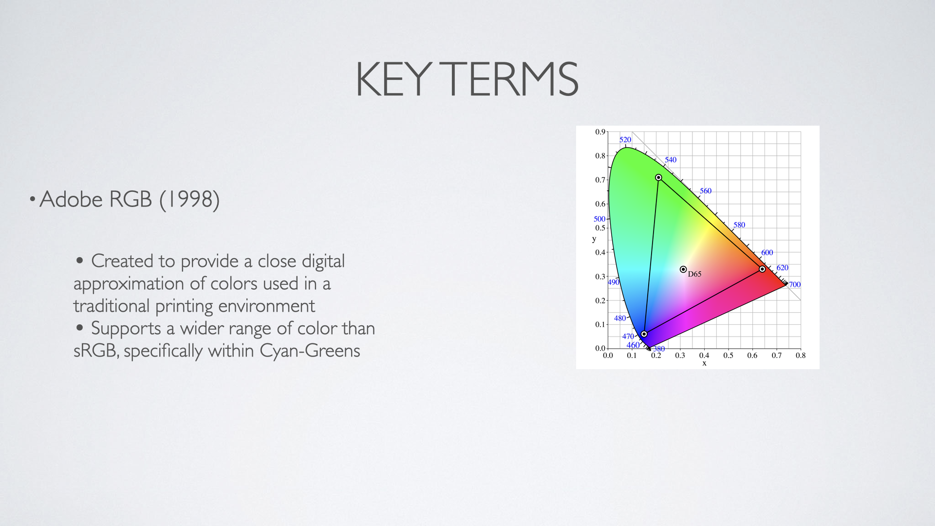
Adobe RGB (1998) has a larger color space than sRGB
Was designed to provide a range of colors similar to printing in a digital environment
Supports a wider color range specifically within the space of cyan-greens
Which to use for video?
sRGB is often the default option, and due to the prevalence of web-based/digital format delivery for independent and amateur video, it is the most widely used color space.
What’s a useful color grading workflow?
Set your blacks to accurate black
Set your whites to the brightest level required by the format.
Adjust your shadows/midtones/highlights to compensate for casting in each of the 3 ranges.
RGB is an additive color spectrum. Add Blues to cancel Yellows (yellow is opposite blue on the color wheel).
Once a neutral and “correct” color setting is created, verify with white in your frame.
One white is calibrated, adjust for moods.
Lighting & Color Temperature
All light is electromagnetic energy detectable by the human eye due to its wavelength. The eye can detect within 400-790THz. Or what we understand to be ‘colors’. Different frequencies correspond to different colors. Daylight can be focused in different frequencies due to environmental conditions such as Smog, or Cloud cover, or time of year. Electrical Lighting also emits within specific frequencies which can also affect the coloring of light.


All light will suffer from a “cast” there is no “True” light. Hence the need to always correct.
White balancing is using a defined color space and a combination of hardware & software to compensate for the inevitable ‘tinting’ or cast that an image will come with. White Balancing is essential because our brains are very good at adapting to environmental lighting conditions that come out very differently in a camera. Most cameras have built in White Balance settings, blank white printer paper is the best surface to calibrate against. However, the most sophisticated corrections are done in software during Post production.


Determining your color space is important for 2 reasons:
It tells your hardware and software how to understand the color of the natural world
RGB is as close to how the eye views light as we can currently get with Digital Technology
The basic measuring tools in color grading software:

Waveforms
Depict a visual representation of the video frame
Top to Bottom: 0=black 100=white, Left to Right is equivalent to the left/right of the video frame
Used to create accurate black and white points
Used to visually understand the contrast range within a piece of video

Vectroscopes
Translates every pixel of color into a plot trending towards one color or another. The Center is neutral, with different colors splaying out along different radials
The further from the center towards a color the greater intensity of the pixel plots
Used to identify color casting that may not be immediately visible in the frame
Helpful for creating accurate skin tones
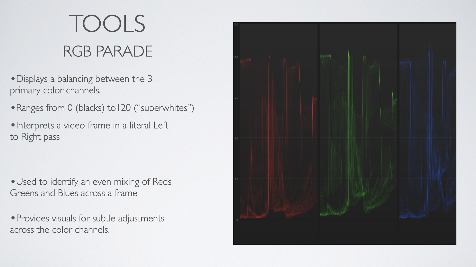
Parades
Used to identify the strengths of the reds greens and blues in a frame in relation to each other
Utilizes the waveform layout
Colors are ‘well balanced’ when the Red Green and Blue categories visually look similar to each other
Helpful in identifying EXACTLY where your color ranges are unbalanced
Recap:
Defining your color boundaries, through prep during capture, out to the basic adjustments in software gives the round trip in color correction concepts.
